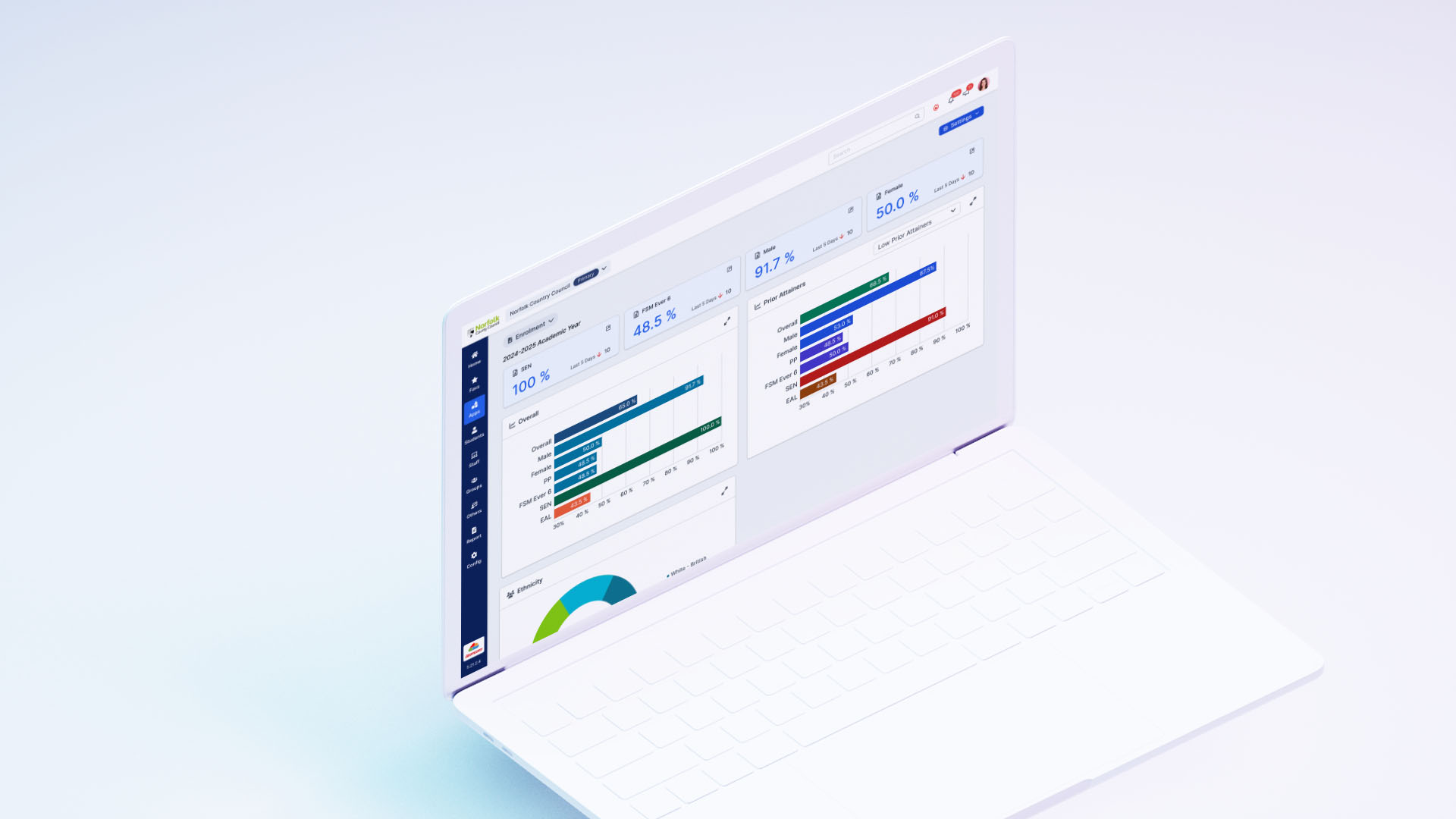
Enrolment Dashboard
The Enrolment Dashboard was conceptualized to address the need for a centralized and intuitive interface for school administrators and data managers to access student enrolment statistics. Feedback from users emphasized the importance of a simple yet effective dashboard that could present key metrics like enrolment numbers by year groups, Free School Meals (FSM), ethnicity, and other characteristics.
This dashboard was designed to provide granular insights while ensuring flexibility through robust filtering options, making it an indispensable tool for data-driven decision-making in schools.
Challenges
Balancing Simplicity with Depth
While users wanted simplicity, they also required the ability to explore detailed data. Striking this balance necessitated careful design of expandable charts and drill-down views without overwhelming the interface.
Complex Filtering Logic
The inclusion of multiple filtering options (e.g., by year group, tutor group, academic year) posed technical challenges. Collaborative workshops with developers and QA teams helped address these complexities, ensuring filters worked seamlessly.
Diverse User Base
The dashboard needed to cater to a diverse audience with varying technical skills. This required a focus on accessibility and progressive disclosure to avoid intimidating novice users while still offering advanced capabilities for power users.
Results
Enhanced Decision-Making
The Enrolment Dashboard provided administrators with actionable insights, enabling data-driven decisions related to enrolment trends and resource allocation.
Positive User Feedback
Post-launch surveys revealed a 40% increase in user satisfaction compared to previous enrolment reporting tools. Users praised the dashboard for its clarity, flexibility, and ease of use.
Increased Efficiency
By consolidating enrolment statistics into a single interface, the dashboard reduced the time required for reporting tasks by 25%, allowing users to focus on strategic planning.
Design Process
Discovery Phase
The project began with an extensive requirement-gathering phase involving multiple user groups. Key findings included:
Users wanted a high-level overview (summary cards) and the ability to dive deeper into specific data (expandable charts).
Filtering options by academic years, year groups, and other student attributes were critical for comparative analysis.
A balance between visual clarity and functionality was essential to accommodate users with varying levels of technical proficiency.
Based on these insights, user personas and journey maps were created to guide the design process.
Design and Prototyping
The design process spanned 3 sprints (9 weeks total) and was anchored in agile methodologies. Each sprint delivered progressively refined prototypes, incorporating user feedback at every stage.
Key Features:
Summary Cards: Displayed at the top of the dashboard, these cards provided quick metrics on enrolment numbers, broken down by year groups, FSM, ethnicity, and other characteristics.
Filterable Charts: Charts were made dynamic with filters for “selected students,” year groups, tutor groups, and report groups, allowing users to customize their view.
Expandable Charts: Each chart included a drill-down capability, leading to detailed data tables for granular analysis.
Academic Year Comparison: A toggle feature enabled users to compare data across different academic years, supporting trend analysis.
Prototypes were built using low-fidelity wireframes for early-stage validation, followed by high-fidelity mockups for usability testing. Tools like Figma facilitated rapid iterations.
Testing and Validation
Weekly user testing sessions ensured alignment with user expectations. Feedback from school administrators highlighted areas for improvement, such as:
Clarifying filter labels for better intuitiveness.
Enhancing chart readability by standardizing colors and data labels.
Simplifying navigation between the summary cards and detailed charts.
These insights informed iterative refinements, ensuring a seamless user experience.
Key Takeaways
User-Centric Approach
Regular engagement with user groups ensured the dashboard addressed real-world needs and expectations.
Iterative Design
Agile methodologies allowed for continuous improvement based on user feedback, resulting in a refined final product.
Scalable Solution
The dashboard's modular design supports future enhancements, such as additional filtering options or new data visualizations.
The Enrolment Dashboard is a testament to the power of collaborative design and agile development, delivering a solution that is both functional and user-friendly.


